Overwatch 2
Blizzard has recently (as of the time this analysis is written) added a Thai localization in their free-to-play game Overwatch 2. Their implementation is basically almost spotless in the text rendering and shaping side, and it does look really good too. There are some small issues heres and theres, but nothing major.
It’s kinda refreshing that we do have a good Thai text in game out of the box.
The Good
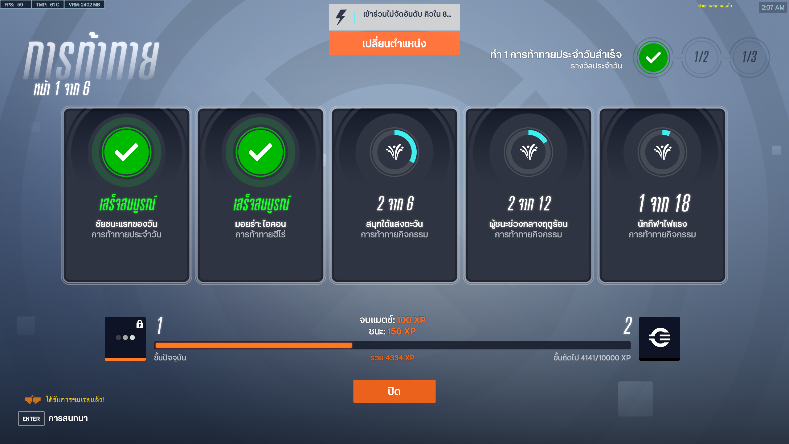
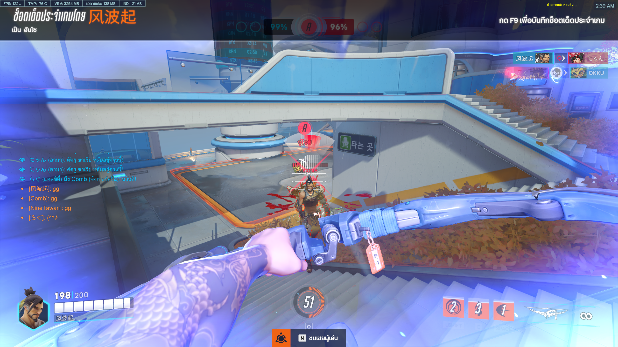
As I mentioned, text rendering and shaping looks really good. Both HUD text and UI text looks perfect.
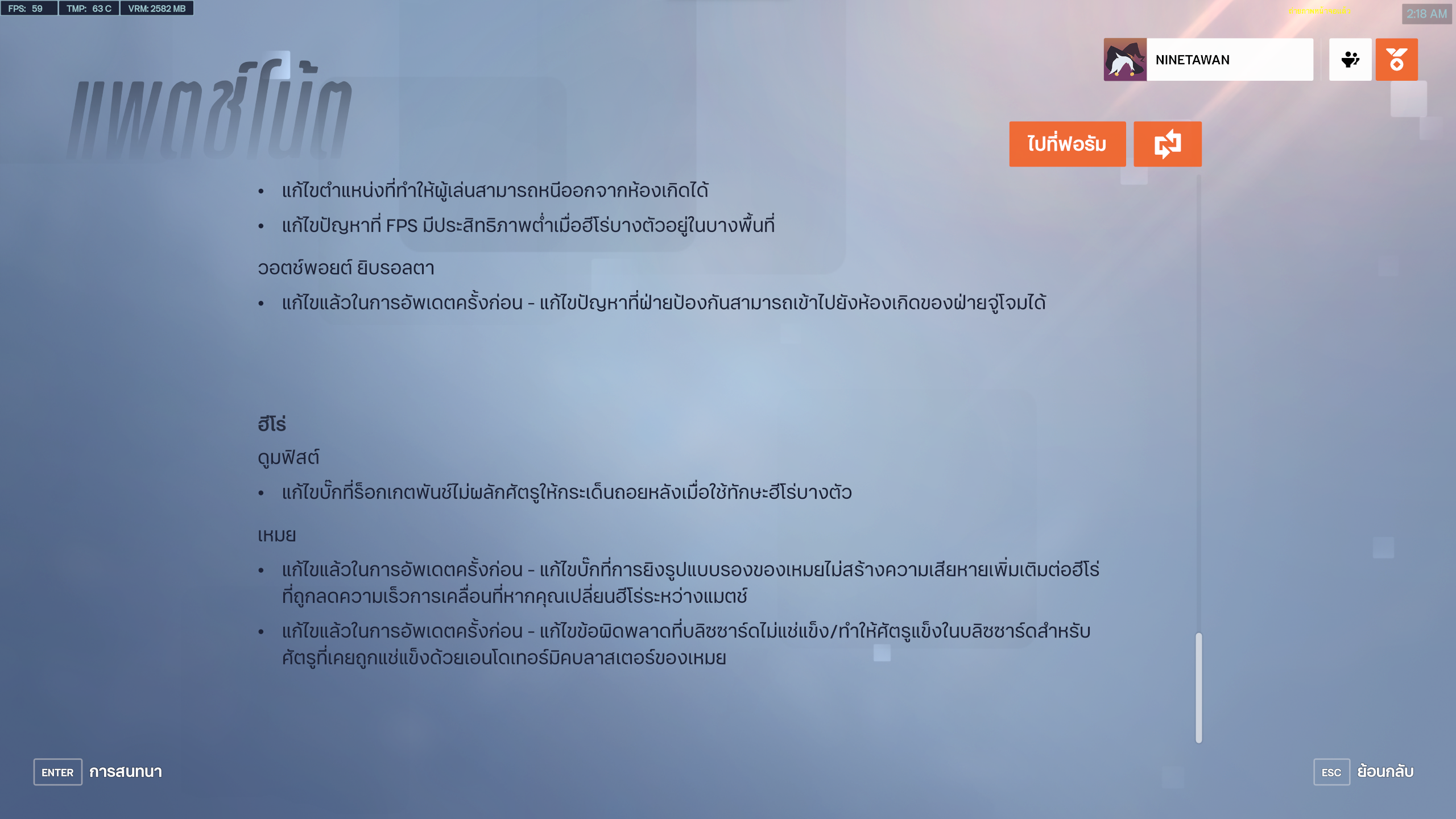
Multi-line text has proper spacing between the line (like in the patch-note menu)
The Bad
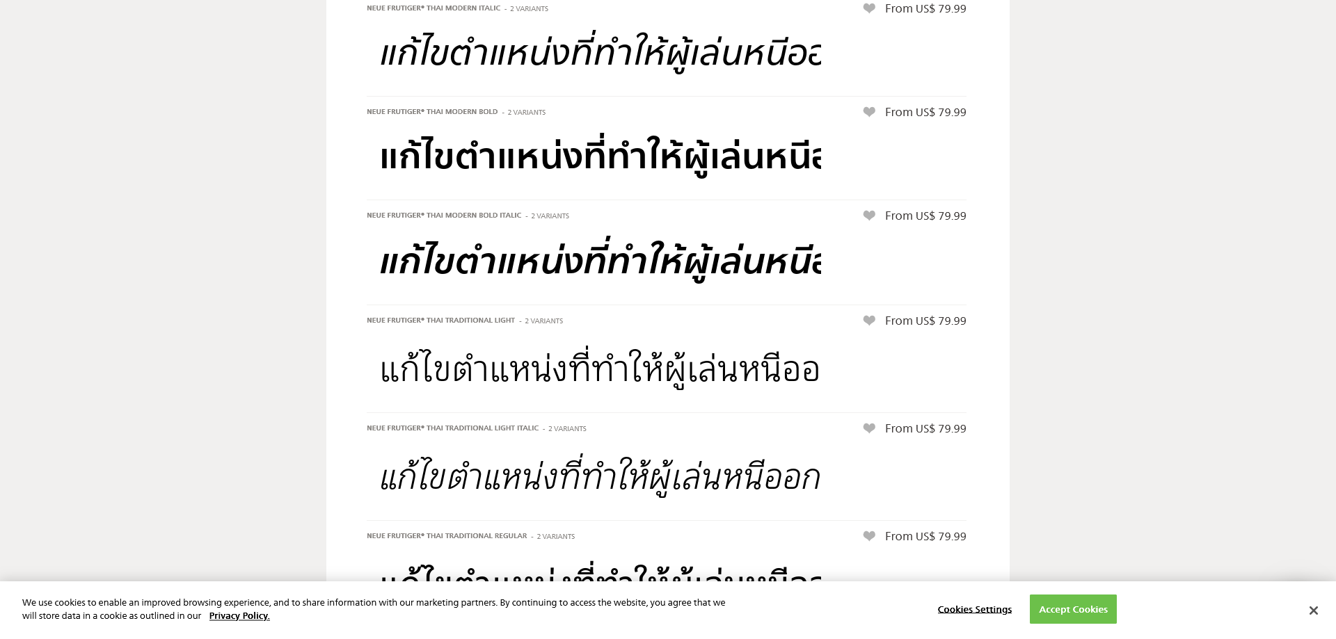
There’s actually one major problem, not to most people, but still major. The typeface used in majority of the UI here is Neue Frutiger Thai Modern by Linotype. The very same font used in Resident Evil Village.
This font looks futuristic with its loopless nature. However, loopless font can be harder to read especially if you are not used to it. I think it’s fine to use loopless font as the design font like headers and stuffs, but using it on paragraph text can be a bit too much. I mean I’ve seen some foriegner studying Thai complains about loopless character. There’s even a specialized class on reading loopless character too!
Neue Frutiger Thai Traditional from the same family might be a better choice in my opinion. In fact, it’s in-use in the input text boxes already.
But changing fonts is a big big issue. Some players might go against it, especially those who can read it just fine like most native speakers. This will be difficult to address I think
Also, I’ve seen some text that’s not properly break when the line break is required. I cannot capture as it depends on the text being display. Basically when the text is not properly break, a tofu shows up at the begining of the next line. That means the line is broken in the middle of a character (Thai is 3 bytes on the UTF-8 encoding, or may be 4?.). I cannot capture it in time so no screenshot here. sorry about that. I did see a tofu once in the suggestion text after I respawn.
The ugly
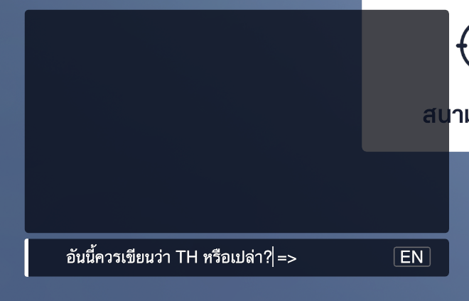
Apparently when the input method is Thai, the indicator at the textbox still displays “EN”.
Also, I think some of the translation is kinda weird. Like the บัฟเฟอร์สามเท่า (three times the buffer, literraly) in the settings (it’s a translation for tripple buffering which is a rendering technique to reduce tearing.) Maybe using it as is or just write the text in Thai without translating it would be better.
And what even worse in terms of translation is in the patchnote. Some of it makes you wonder what the developer is trying to say.
And I’ll end with the game credit:
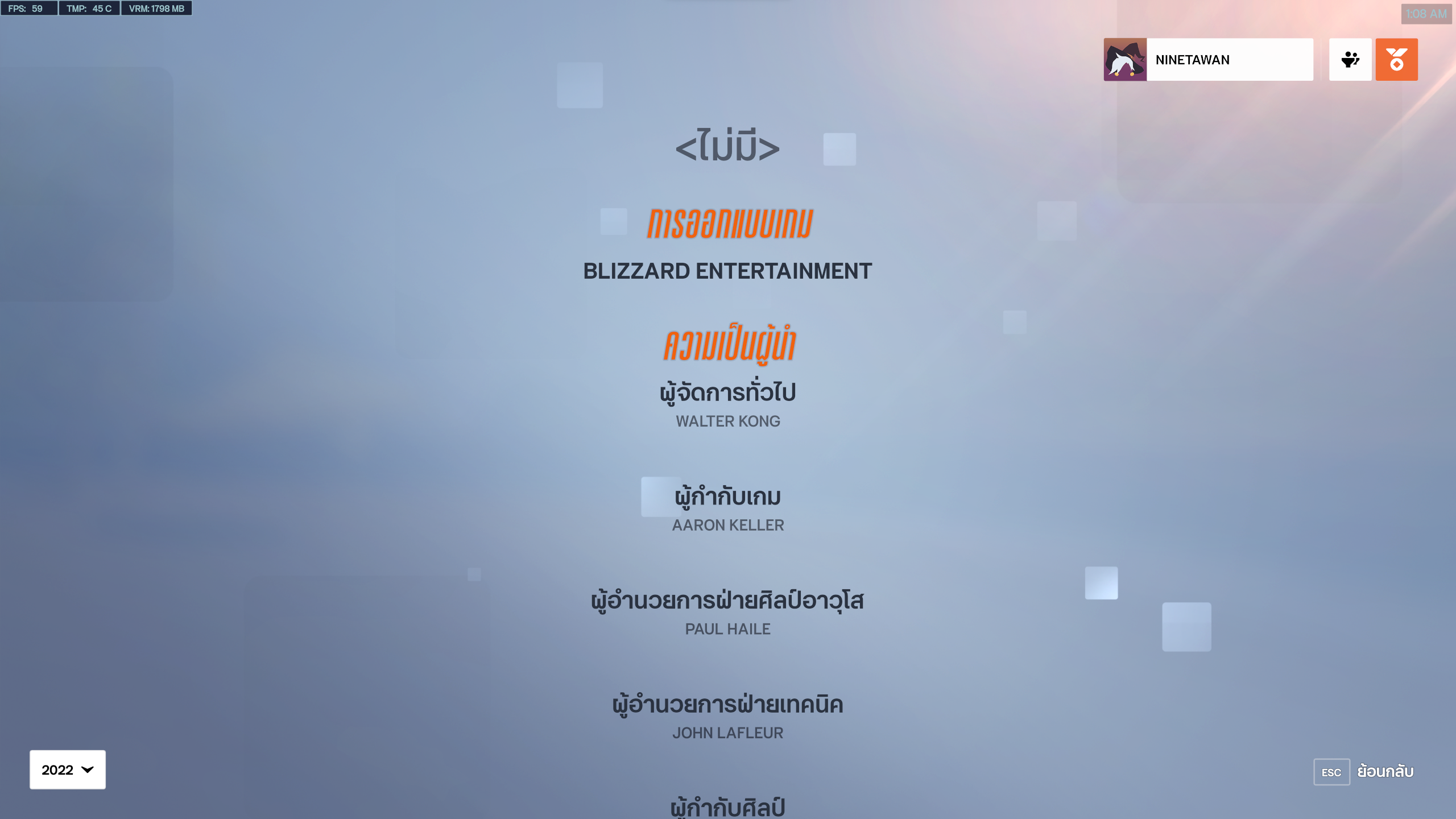
what is that <ไม่มี> for ?
Closing
As I mentioned, this game implement Thai text almost perfectly. There are some small issues as mentioned, and most of them is my nitpicking.
I wish to see these level of implementation in more and more games in the future.